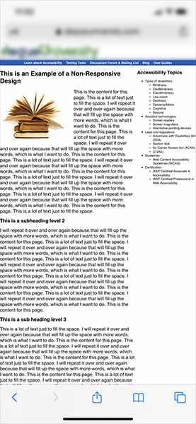
What is a responsive website anyway? For the viewer pulling up your site on their laptop… or iPad… or cell phone, it means that your website responds to different screen sizes and orientations. Page content is automatically resized, moved, and organized to best display within the confines of the screen on which it is being viewed.
On a non-responsive platform, the site may look fine on your desktop or laptop computer, but when you look at it on a smaller device such as your phone, the site does not re-position or re-size the content making for an inefficient and time-consuming experience.
First, let’s take a look at a couple of example images of non-responsive websites as viewed on a cell phone. Notice how all of the information is trying to fit on the smaller screen size, which greatly reduces the readability and means the viewer will need to zoom and swipe to read the content. This is what you don’t want!
And here is an example of a responsive website. This video on the left is how you might view this site on your desktop or laptop computer. And on the right is how the same site might look on your mobile phone. Notice how the content re-positions itself so you never have to swipe left to right. Much more intuitive and efficient!
Check out the SeeQuinn portfolio for examples of responsive web design. Try changing the size of your browser window to see how “responsive” works to optimize your viewing experience!


